”Developing and implementing a new visual identity is a major undertaking for us. We need a partner who can deliver creative magic — but also support us through implementation. At the same time, that partner has to collaborate seamlessly with our internal teams and add that extra edge. Nosy has been a close and trusted partner in all of these aspects.”
Fredrik Palmquist
BDX
BDX is one of northern Sweden’s leading logistics and contracting groups, offering sustainable solutions in construction, transport, and industrial services.
Challenge
With a strong market presence and recognizable identity, BDX didn’t need a full rebrand – but a careful evolution. The goal was to refine the visual expression to better reflect the company’s persona: bold and forward-leaning yet grounded in responsibility and collaboration. A brand that builds the future – together – and does so with both force and finesse.
Approach
Our mission was clear: preserve the core, sharpen the edges. With logo, typeface and primary colors already in place, we focused on developing a refreshed visual language – built around a deeper narrative and a richer emotional register.
A new color palette extended the identity with earthy tones and natural depth to soften the industrial edge and supporting the brand’s more human and sustainable values.
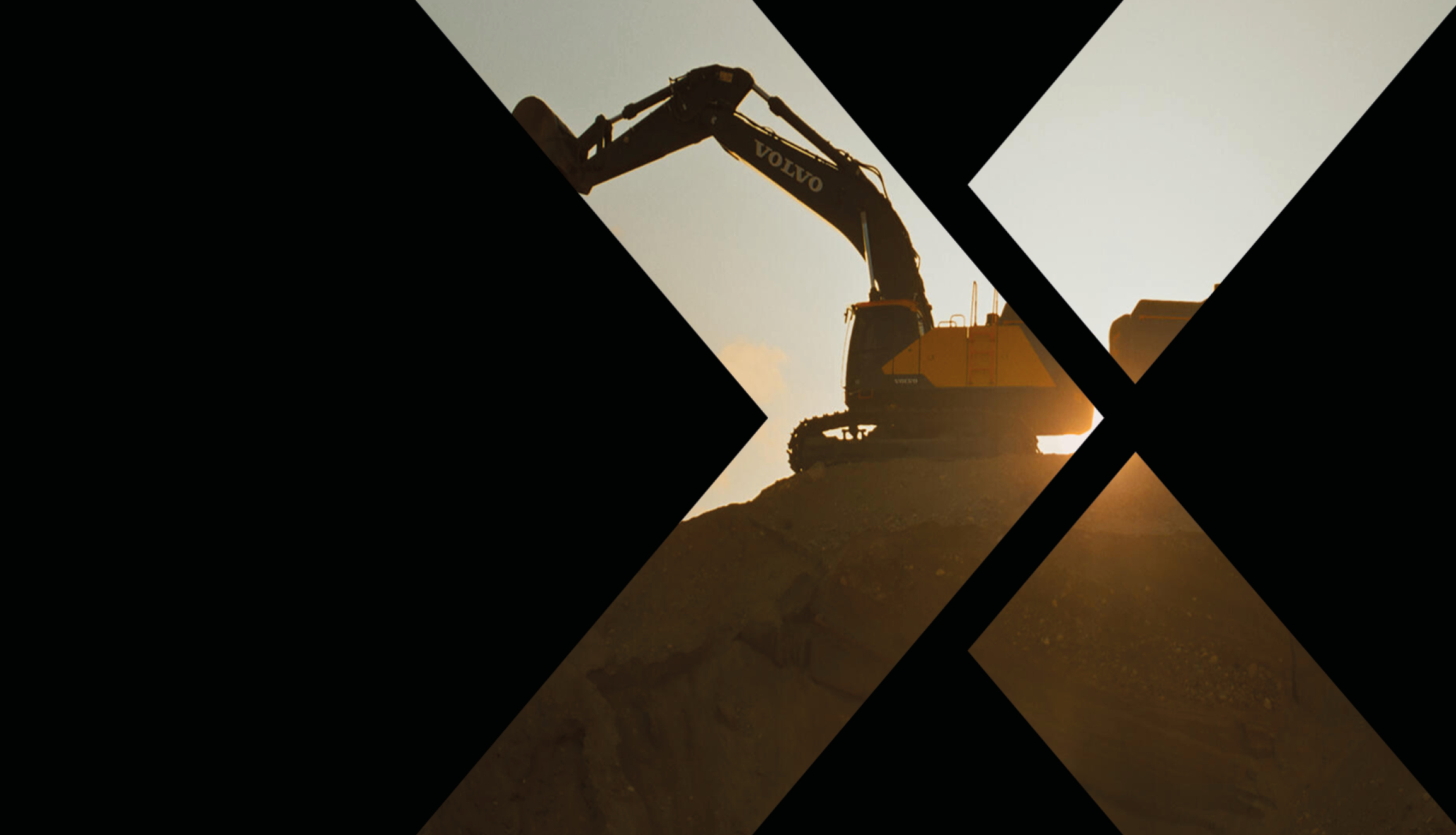
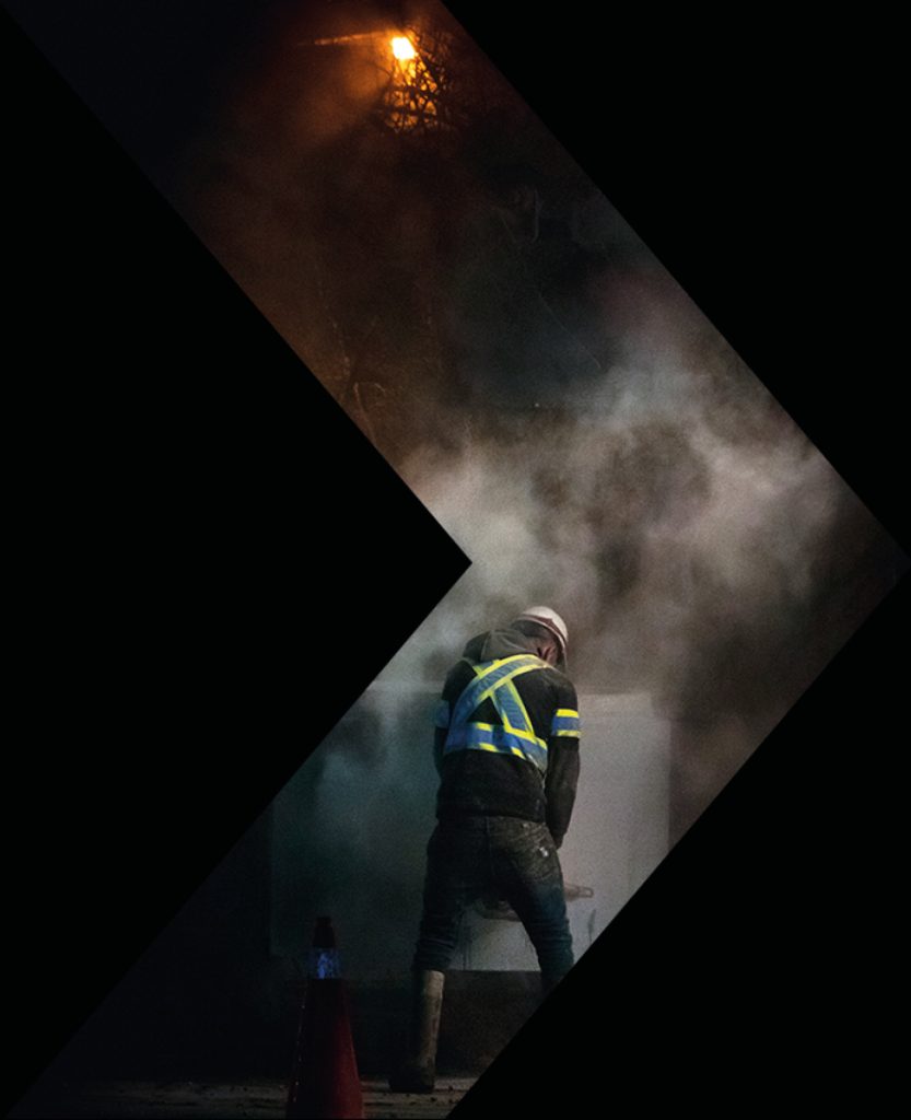
At the heart of the identity is the X – a symbol of both the unknown and the ambition to shape what’s next. The red arrow within it signals movement and direction. We expanded this idea into a flexible system for image treatment, using the X to frame and cut to create visual tension, direction and drama.
Alongside a new image direction rooted in scale, landscapes, people and power, the result is a visual system that evokes pride, purpose and progress.
Outcome
A sharpened identity that respects BDX’s heritage and strengthens its ability to grow. The new visual framework is designed for consistency and impact across all platforms, ensuring the brand remains bold and relevant over time.